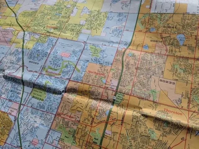
Part of a 1996 Rand McNally map of the Denver area, showing how different municipalities were shaded in different colors.
One thing I always appreciated about the old Rand McNally street maps was how each municipality was shaded in a different color with clear boundaries, making it easy to see where one stopped and another began. This allowed readers to know at a glance where city limits were, and understand which areas were incorporated into which cities, and which areas were unincorporated. The lack of municipality boundaries is one thing I miss about most modern digital maps.[1] I understand municipal boundaries are of little practical value for most people's daily lives.[2] Nonetheless, I think there are stories to be told by this data.
The area between Denver and Fort Collins is rapidly growing, with many formerly small towns booming and expanding their city limits in surprising ways. Likewise, many established suburbs are extending to areas far away from their traditional cores. The more I travel around this area, the more astonished I am by how some areas seem to be part of suburbs and towns that I never would have expected. I often find myself wishing for a map that clearly shows municipal boundaries so I can get a better idea of what is going on.
posted at 2026-03-28 10:20:43 MDT
by David Simmons
tags: gis maps colorado